


The Best Fall Photography Fashion Trends
A BALTIMORE GIRL SPLENDID 6: THE BEST FALL FASHION PHOTOGRAPHY TRENDS OF 2017
I have said it a million times, but I will reiterate, "If you hate it before your session. you will hate the photographs that come from that session". Do keep in mind that these are ideas. not guidelines. Please, be you and be comfortable in what you wear. Don't wear something you hate, just because fashion says its "in". The best thing you can do in a photo session is to show your true colors, be natural and laugh. A real laugh beats a fake smile any day. As a general rule of thumb, you should dress appropriately for the season. Obviously, don't wear a tank top and shorts to your fall photo session. The other 6 ideas in this blog are very generalized fashion ddirections. I have left them loose, so that you have many choices. You can make each of these ideas fit your style and your budget.
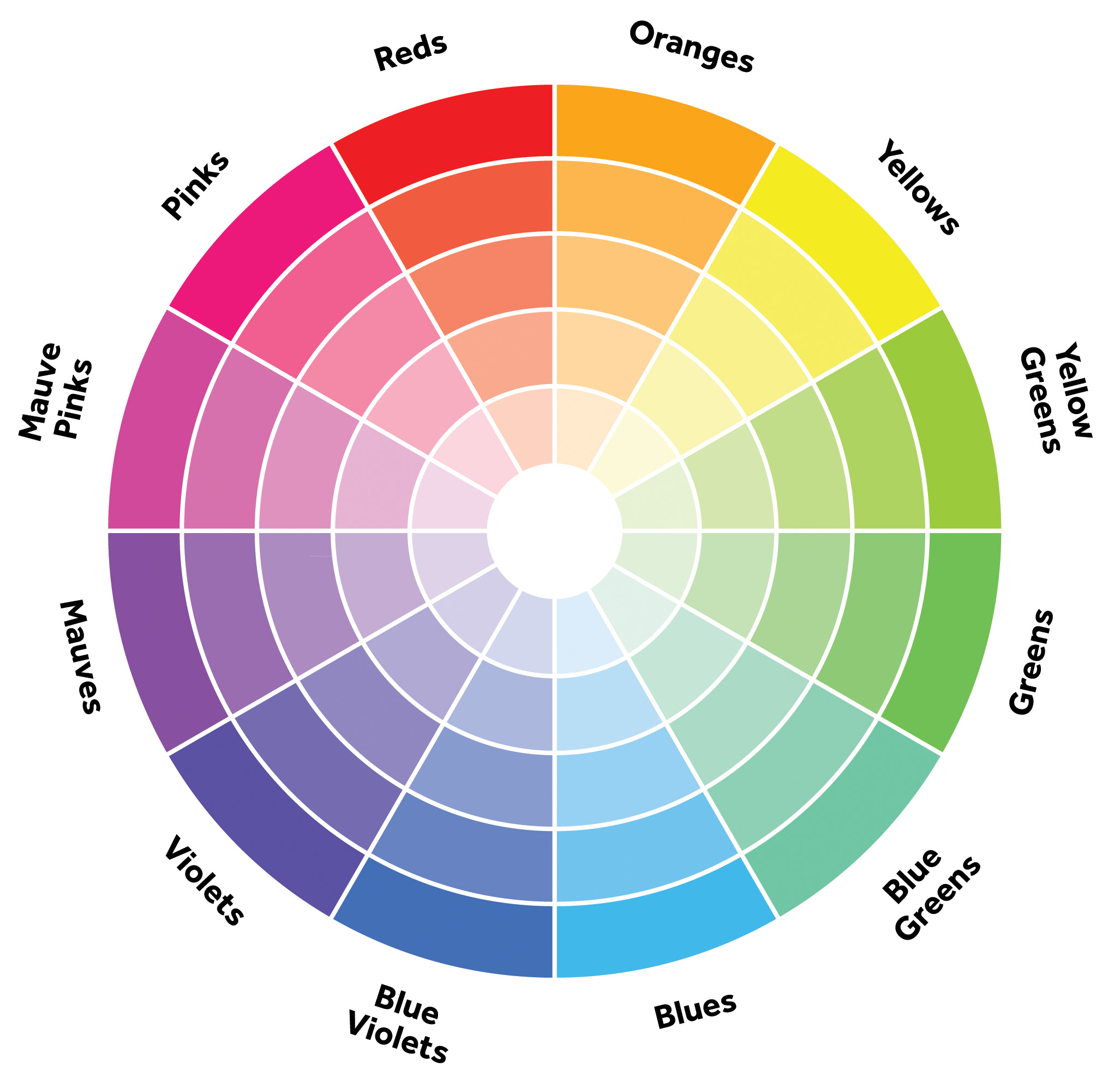
1. Matching Color Schemes
Let's start simple here, with my famous color wheel. Now, chances are if you have booked an engagement session with me, you may have received this awesome little color wheel in an email. What does the color wheel tell us and why is it important? It is important because it tells us what colors will pair up well. There's a few ways you can use the color wheel. The first is by picking complementary colors, or colors across from each other such as red & blue or green & mauve. The second, is by using analogous colors, which are colors beside the color of your choice. For example, if you wear yellow, then your family should wear variations of yellow oranges & yellow greens. This is perhaps my favorite way to use the color wheel, because it's simple and the colors somewhat match, without being tacky. The third way to use the wheel, is by picking a triad. Basically, you make a triangle using the color you choose. For instance if you choose mauves, then the family should be in oranges and blues. Simple enough, right? Does this always apply, no, but it's a great place to start at.
2. Choose Solid Colors Within a Pattern
This one is very simple. It may be the simplest thing on the list, really. If your husband is wearing a plaid shirt, go simple and choose a solid color that is in that shirt. If you are wearing a dress, have hubby go simple and choose a solid color from that dress. This can work with a whole family too. Have the boys wear matching plaid or a pattern shirt, and the girls can each wear a solid color within that pattern.

3. Shades of Neutral
It's a perfect jumping off point. Go with shades of neutral colors: tan, grey, dark blue, golden hues and of course white or off white. You can never go wrong with this. Add is a few neutral patterns & a cute scarf. Photographer Carina Skrobecki hit the nail on the head with this Pacific Northwest Sunrise Engagement stylized shoot. It is beautiful!!

4. Go For Classic Fall
Yep, I said it. Be cliché. It is fall, enjoy it, cherish it, celebrate it. I do, it is my most favorite time of the year!! This idea is so simple. Pair jeans and denim fabrics with fall hues like reds, oranges, yellows and neutrals. The look is timeless, classic and you can never go wrong here. My only advice, it to make sure the fabric patterns don't clash. Try using plaid with a simple red & white print and solid color scarf, just like this example blogged by Tiffney Photography.

Orange & brown paired together create a perfect fall color combination, that you just can't beat. It looks great & it radiates the feeling of fall.

Orange or yellow & navy is also a great pairing, like this example below.

5. A Pop of Color
The notion here is to make one of your family members a focal point in the photo session. Most parents choose their child to sport the pop of color. This related back to #3, & the neutrals. Most of the family (or just mom and dad) will wear neutral and the kid/s wear a pop of fall color. Mom or dad can also sort the pop of color. For the kids, this can be a red dress, a yellow jumper or a cute plaid shirt. For adults, choose a plaid or printed scarf or a yellow/orange/red sweater or a colored blazer or vest. You could even wear a pair of colored boots. Now, I'm not into the velvety colored boots, but I can't deny they look cute on other people. They just aren't for me. Anyways, let me get back to the point... this example by GL Photography, shows the power a pop of color has. Mom stands out in this picture. She is the focal point in the photo & the center of her family's universe. It's a beautiful picture and powerful message, too.

6. Mauves are Magical
This year shades of mauve have been all over the place. This shades has the feeling of autumn. Mauve pairs with tan or grey wonderfully. All you have to do is pair some mauve, with prints like plaids or paisley & VOILA- an instant fall masterpiece of your family. This photography by Caffeine and Cuddles is an adorable example.

This photography taken by Jillian Farnsworth photography plays on the pop of color and uses mauve, too. The outcome has a classic fall feel and is a picture any mom would be proud to hang on her wall.

Thanks for stopping by & reading my blog. I hope it has helped out somehow. I am still booking for fall photo session. I would love to capture some fall memories for you & your family. If you would like to book, get in contact with me.
Email: baltimoregirlphoto@gmail.com
Phone: 443-653-4712
FB: www.facebook.com/baltimoregirlphoto
The photographs in this blog do not belong to me. Each photograph, when clicked, will link back to the original photograph. No copyright infringement is intended. I do not own, nor claim to own, any of the photographs herein. However, the name & logo for "Baltimore Girl Photography" and "Baltimore Girl Splendid 6" are copyright.


